Signed in as:
filler@godaddy.com
Signed in as:
filler@godaddy.com
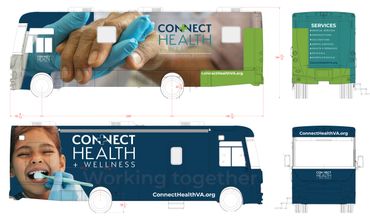
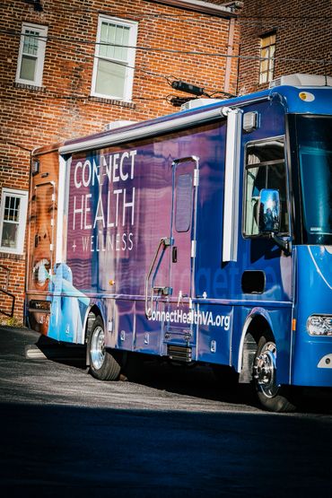
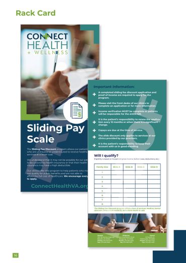
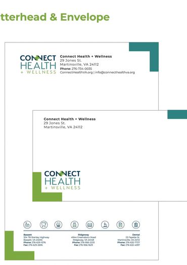
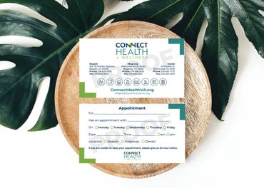
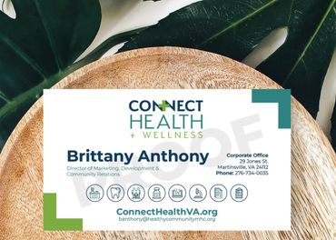
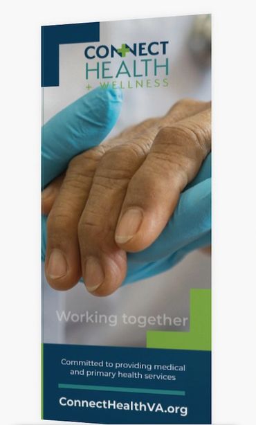
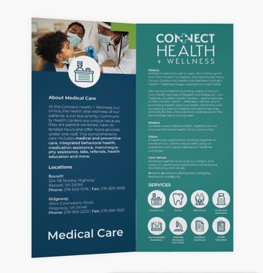
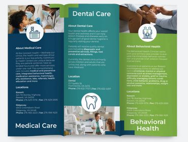
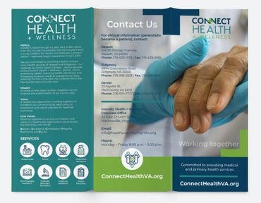
As a freelance branding manager, I had the opportunity to collaborate with the Martinsville Henry County Coalition for Health and Wellness on their rebranding project. The goal was to address their growth-related challenges and improve communication across their various locations. Over the course of the project, I worked closely with the organization to rename and develop a compelling tagline that captured their expanded reach and interconnectedness. Through in-depth brand rediscovery sessions, we identified their new mission, vision and core values, which formed the foundation of a comprehensive brand strategy. This strategy guided the development of a brand style guide and new logo, ensuring consistency across all marketing collateral. Additionally, we refreshed their mission statement to align with their redefined identity and goals. Utilizing a GoDaddy template, I designed and customized a modern website that showcased their services and community impact. The rebrand rollout included a content calendar to streamline messaging and engagement strategies, along with a revamped social media presence tailored to their target audience. Thorough audience research informed our decisions throughout the process, ensuring resonance with their demographic. To support their ongoing online presence, a website retainer was established for maintenance and optimization. Overall, this freelance project successfully positioned the organization for continued growth and impact in promoting health and wellness across their region.

The rebranded logo is sleek, contemporary, and highly readable. Given the lengthy name, it was crucial for the new name and logo to convey the seamless connection between healthcare providers and patients while emphasizing the organization's commitment to community engagement and service. The updated color story, prominently featured in the logo, plays a pivotal role in shaping the overall branding strategy.

The rebrand's color story maintains continuity with the organization's previous branding, which featured Royal Blue and Apple Green. The new primary colors, Pantone 302 C Blue, Pantone 7737 C Green, and Pantone 7475 C Blue/Green, stay within the blue and green color family while providing a refreshed and contemporary palette.

The website for the rebrand needed to be a platform that the marketing manager could manage independently, while still prioritizing SEO and user-friendly navigation. After careful consideration, we opted for a GoDaddy template-based website with custom branded graphics. This choice ensures not only ease of management but also maintains a focus on SEO optimization and intuitive navigation for visitors.





Copyright © 2024 Jeana Aaron Creative Design & Marketing - All Rights Reserved.